Biss wins more than 99 times out of 100
in 10,000 simulations of Illinois’ 9th District.
Elleson’s best night loses by 33.8 points.

This is the small model, a forecast of the 2026 general election in Illinois’ 9th District, written in one night in 155 lines of Python: the most compact precinct-by-precinct model I could manage without giving up accuracy.
Every precinct starts from its 2024 baseline and takes three shocks each simulation, a national swing, a swing shared with precincts that resemble it, and a little noise of its own (the δenv, δc(i), and εi of the methods note below), all applied in log-odds space so the safest precincts move the least.
For a more detailed model, and one that is actually useful rather than a one-night project, go to the VoteHub forecast. Hover any of the 435 precincts below; click one for its full card.
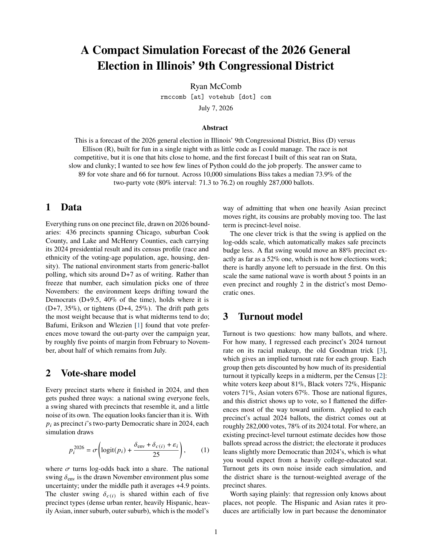
Who’s favored to win each precinct?
Hover any of the 435 precincts for its forecast; click one for its full card.
73.9% median Biss two-party · 71.3–76.2 80% interval · >99.9% win probability · ≈287,000 ballots · 155 lines of Python
Where does every precinct land?
Each dot is one precinct, sized by expected ballots, stacked at its projected margin.
What do 10,000 simulations look like?
Each dot is one simulated outcome. Hover a dot to see the district under it.
The swing is applied in log-odds space, so safe precincts move less than even ones; a shared draw per demographic cluster keeps the errors honest, because when one heavily Asian precinct moves right its cousins probably are too; and turnout comes from an ecological regression discounted by how much of its presidential electorate each group typically keeps in a midterm. The whole method fits on two pages: read the methods note (PDF), or see the code on GitHub.
What are the closest precincts?
The knife-edge precincts, with the range each one covers across the simulations.
table 1. Unusual and not-so-unusual outcomes, according to the simulations.